Modern design for a mission-driven organization
Maturing a non-profit brand through site design
BECA had a problem any thriving organization should be so lucky to have; they’d outgrown their website. What once served as a basic online presence now felt more like an anchor. The site felt out of date, using repurposed components, and was difficult to update. It wasn’t necessarily broken, but it wasn’t built for the future either. It was time for a facelift

challenge
A dated site
BECA had a problem any thriving organization should be so lucky to have; they’d outgrown their website. What once served as a basic online presence now felt more like an anchor. The site felt out of date, using repurposed components, and was difficult to update. It wasn’t necessarily broken, but it wasn’t built for the future either. It was time for a facelift
solution
Our Approach
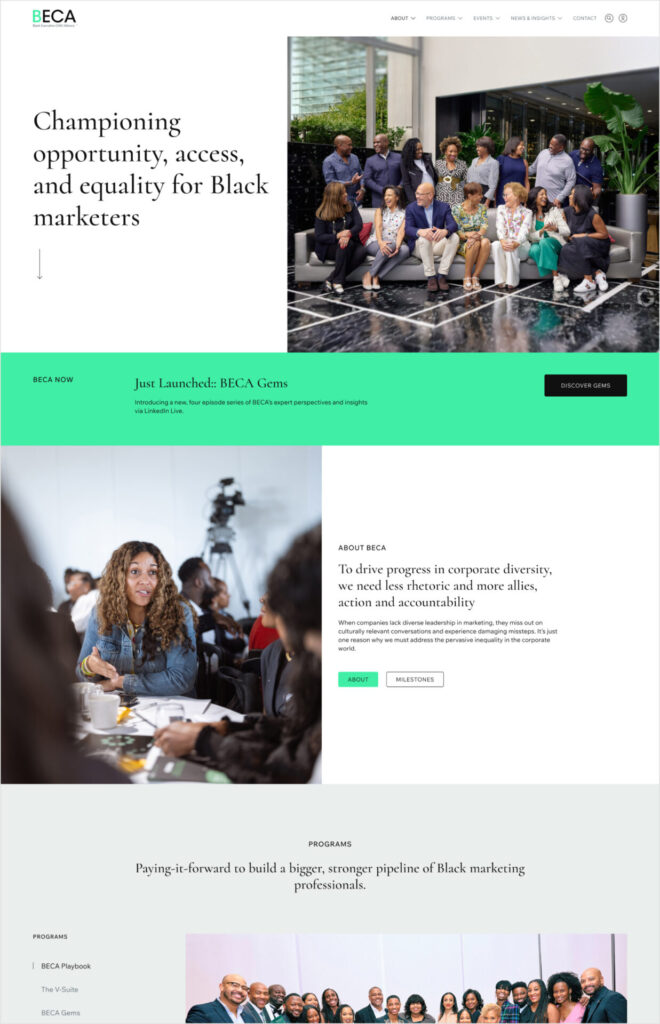
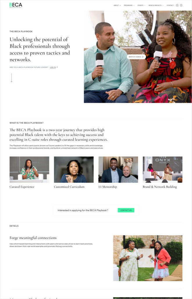
We rebuilt from the ground up—but kept BECA at the center. Information architecture built around clarity and scale, reorganizing and future-proofing the global navigation all while being fully-optimized for mobile. We introduced a concise system of modular components for easy updates and helped support clean storytelling. We included guardrails to the components that gave their team guidance with structure so they could focus on the goals… Because chaos is not a CMS feature.
BECA needed a site that could keep up with their growth, and was designed for the future.
- A content system they could manage themselves—without breaking it or needing to call in the cavalry for regular updates.
- Clear structure to support growth (content, events, media, milestones, programs, etc).
- Component-based design, with built-in boundaries (the good kind).
- Structured Galleries and Event listings that didn’t feel like a photo dump.
Information Architecture and Content Mapping
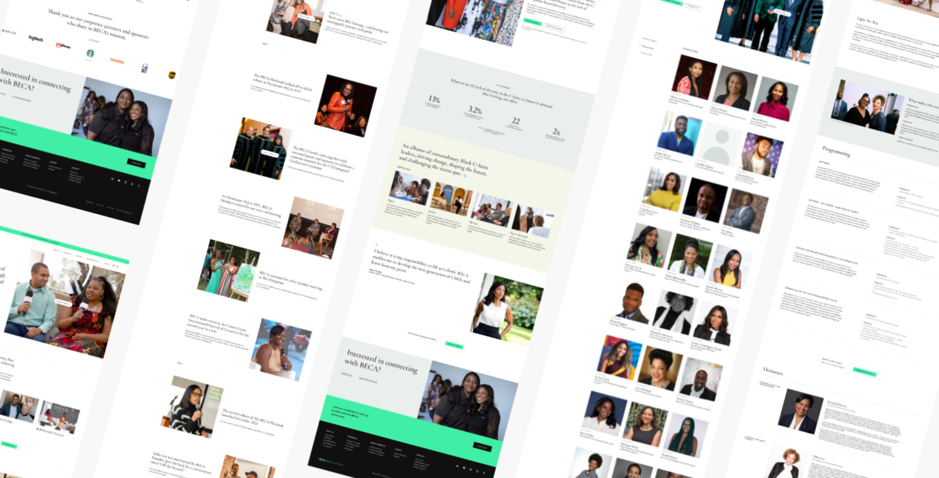
BECA’s site had grown fast—and with that growth came clutter. Pages were added as needed, without a long-term structure in mind, and eventually, the logic of navigation began to unravel. We took a step back and reimagined the information architecture from the ground up. The goal: make it intuitive for users, and future-proof for BECA. We reorganized the content into a cleaner hierarchy, clarified navigation paths, and introduced flexible page groupings to accommodate new programs and evolving content.
The new information architecture strips away bloat and reintroduces logic: intuitive pathways, cleaner page hierarchy, and scalable sections that can grow with the org. Less guesswork. More clarity. Fewer dead ends. The result is a structure that reflects where BECA is today—and anticipates where they’re headed next.
Clarity and scalability
To make the updated BECA site future-ready, we restructured key content areas with scalability and user clarity in mind. Each section was built on repeatable patterns and thoughtful navigation to ensure a consistent, intuitive experience as BECA continues to grow.
- Milestones: A reverse-chronological timeline with templated entries and a left-rail navigation that makes BECA’s history both easy to browse and easy to build.
- Programs: A landing page and templated structure for individual offerings, designed to accommodate current and future initiatives while helping visitors compare before they commit.
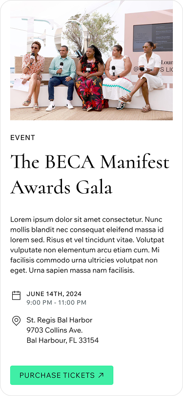
- Events: A split system separating upcoming events from photo galleries, paired with flexible templates that add context to past events and avoid page sprawl.
- News & Insights: A mirrored layout for press coverage about BECA and about its members, featuring highlighted articles and a chronological archive with “load more” functionality.
- Future Leaders: A yearbook-inspired design organized by program and class year, with left-rail nav, headshots linking to bios, and expandable sections to keep things manageable as cohorts grow.
Upleveling the visual identity
The core of the BECA brand remained the same. The original themes and ideas were carried through, but evolved to bring a more refined and elegant aesthetic to the site.
White mode and large photography
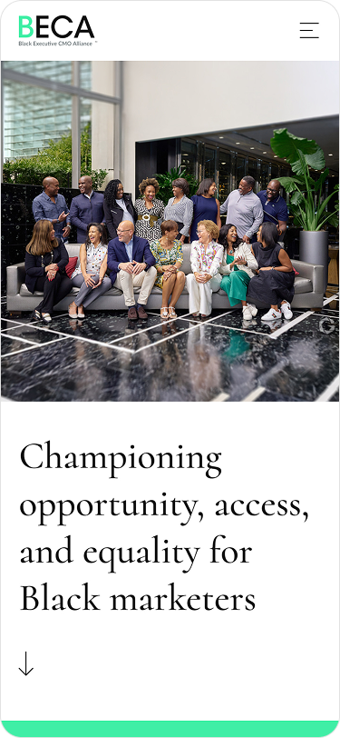
From the outset, our creative direction emphasized one core principle: people are at the heart of BECA. The organization’s identity has always been deeply rooted in its members, so it was essential that this human-centered ethos be reflected prominently throughout the site’s design.
Photography became our primary storytelling tool. We minimized visual obstructions—removing overlays and unnecessary filters—to allow vibrant, high-quality imagery to shine. These photographs take center stage, commanding a significant portion of the screen and immediately communicating BECA’s spirit.
For new visitors seeking to understand who BECA is, there’s no more authentic introduction than the genuine moments captured: people smiling, engaging, and in action. The result is a visual experience that feels open, welcoming, and inherently personal—an invitation to join the conversation.
In reimagining BECA’s digital presence, one of the most impactful changes was the transition from a dark-themed interface to a clean, light-mode design. The previous dark backgrounds, while bold, contributed to a visual weight that felt heavy and somewhat outdated. Shifting to light mode introduced a fresh sense of openness and clarity—an aesthetic better aligned with BECA’s forward-looking energy and optimistic spirit.
Color usage was another area where we applied deliberate design restraint. Where the original palette included upwards of ten shades each of green and gray, we streamlined the system to just one green and three carefully chosen grays. This reduction not only enhances visual consistency but also reinforces a more polished, professional tone across the site. The result is a cohesive and modern interface that supports both usability and brand alignment
Typography and Iconography
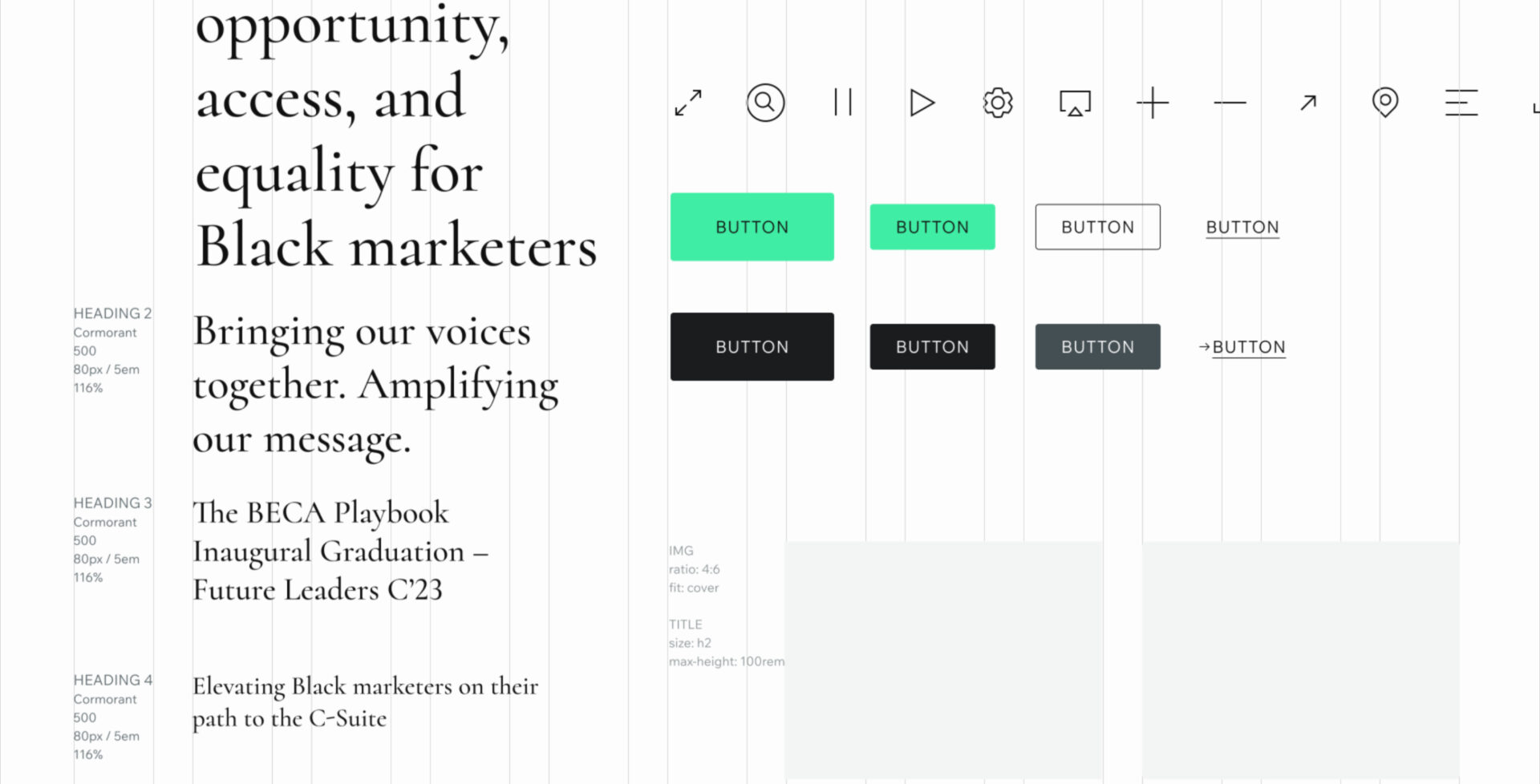
To further elevate BECA’s visual language, we made strategic updates to the typographic system. The classic serif Baskerville was replaced with Cormorant—a refined Roman typeface rooted in tradition and often seen in academic and luxury contexts. Its elegance and subtle authority bring a quiet confidence to the brand, reinforcing BECA’s credibility and expertise.
Complementing this is the introduction of Wix Madefor as the primary sans-serif. This modern, geometric font enhances legibility while maintaining a clean, contemporary look. Generous internal spacing softens its appearance, contributing to an overall sense of lightness and balance across the site.
In tandem with the typographic refresh, we developed a bespoke icon set. Minimal, geometric, and precisely crafted, the icons are designed to align seamlessly with the broader visual system. They add a layer of cohesion and finesse, reinforcing BECA’s identity as a forward-thinking, detail-oriented organization.
Together, these elements strike a thoughtful balance—Cormorant brings a sense of professionalism and gravitas, while Wix Madefor introduces energy and approachability. The result is a typographic and visual system that feels both sophisticated and inviting.
Design system
All of this work is encapsulated in a bespoke design system. Built on a fluid grid foundation, it offers a responsive and scalable framework that adapts seamlessly across devices and screen sizes. By using percentage-based columns and flexible breakpoints, it enables consistent alignment and spatial rhythm while maintaining content flexibility.
IThe system includes a cohesive set of WordPress blocks, patterns and spacing tokens—all designed to enhance the brand’s identity while maintaining usability and accessibility. With its modular structure and fluid layout principles, the system empowers BECA to build and maintain a site that feels modern, intuitive, and highly adaptable.
White glove WordPress development
Our Product and Development teams partnered closely with BECA to define key requirements and guide the technical architecture and implementation strategy. A top priority for BECA was a more intuitive authoring experience, so we focused on building a block and pattern-based WordPress theme that leverages the native Gutenberg editor for flexible content management. To ensure a seamless transition, we developed custom tooling to migrate and restructure content from the existing site, preserving years of legacy content. The result is a modernized site that builds upon the foundation of their previous platform while offering a significantly improved editorial experience.
The new site builds upon the foundation of their previous platform while offering a significantly improved editorial experience, bringing greater structure and interconnectedness to their core content areas—Members, Classes, Events, and Galleries—highlighting their presence throughout the site via thoughtfully designed custom blocks.
development
Custom development for long-term maintainability
Amp followed a collaborative, phased approach to development, beginning with stakeholder workshops to define functional requirements, user flows, and technical constraints. Our development team then built a modular, responsive site architecture optimized for performance, accessibility, and scalability. We integrated a content management system that empowers BCHD’s internal teams to update content easily without developer support. Throughout the process, we prioritized WCAG compliance, SEO best practices, and cross-device compatibility to ensure a secure, user-friendly experience for all visitors.

1,642
Total Link Clicks
Find out how we can put solutions like these to work for you.


