Skip to main content
Toggle navigation
Work
Services
Industries
Thinking
About
Contact
Thinking /
Thinking
Skip to post list
All
News
Insights
Creative
Commerce
Culture
Nudgenomics™
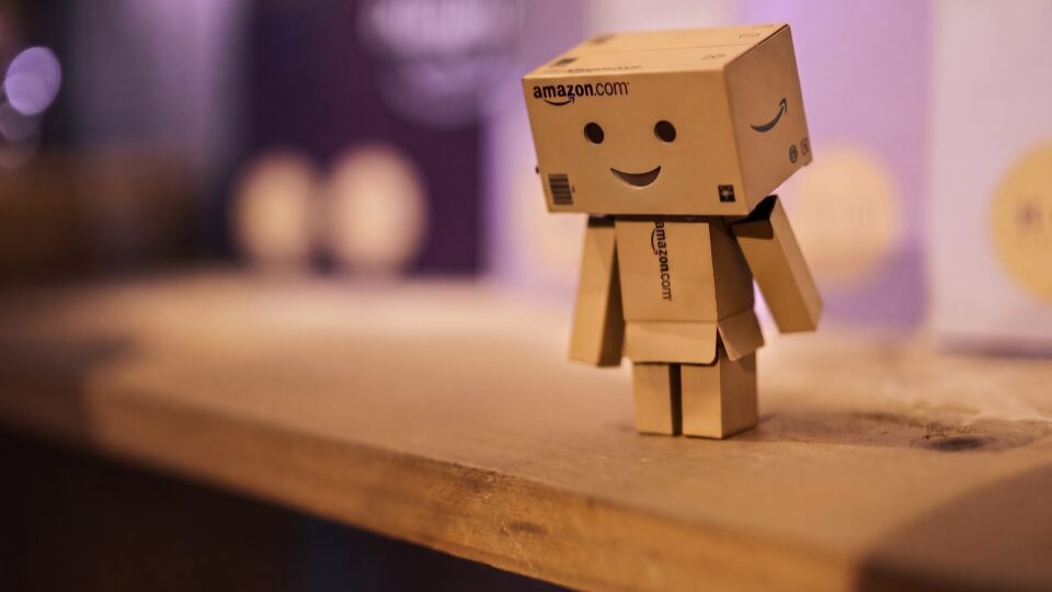
The Utility Pivot: Amazon Prime Day 2026
Amp
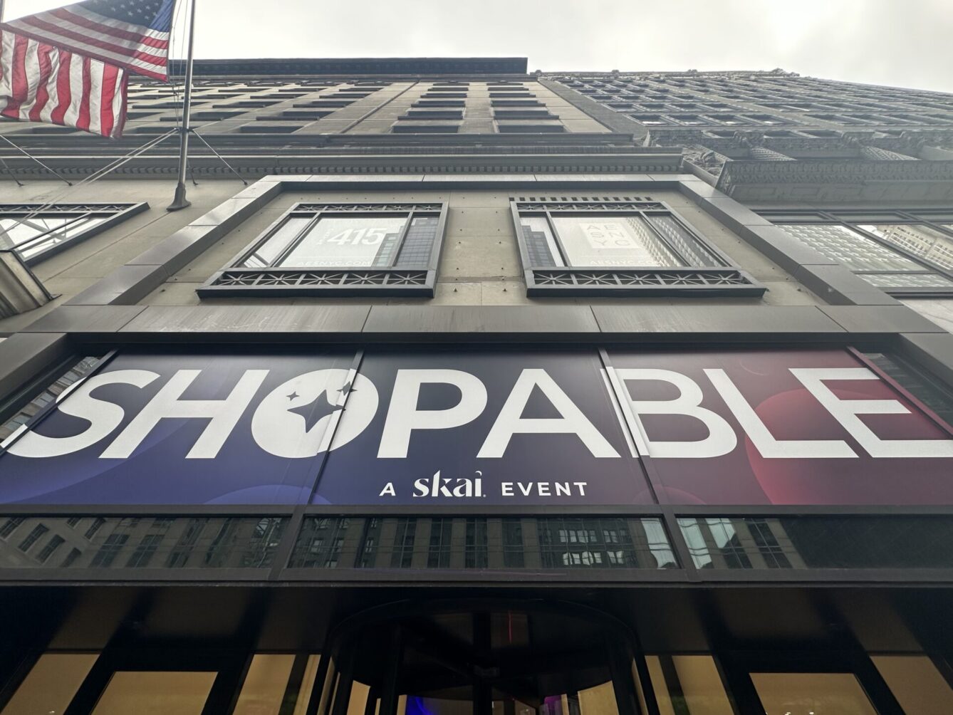
SKAI ShopAble 2026: Trends & Takeaways
Amp
Earned Media Is the New Infrastructure for AEO and GEO
Amp
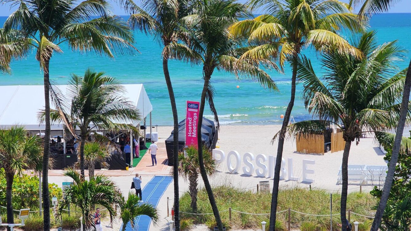
POSSIBLE Is the American Version of Cannes
Amp
Sweepstakes: The Stuff of Dreams and Brand Building
Amp
The Psychology Behind Getting Mother’s Day Right
Amp
“Maycember” Madness
Amp
Reaching Today’s Gen Z Drinkers
Amp
1
2
3
4
…
9
Last
Let's start something great
Contact