Skip to main content
Toggle navigation
Work
Services
Industries
Thinking
About
Contact
Thinking /
Thinking
Skip to post list
All
News
Insights
Creative
Commerce
Culture
Nudgenomics™
Beyond the Sponsorship: Strategic Marketing Lessons from the 2026 World Cup
Amp
Stop Treating Your Brand Promotion Like an Equation
Amp
The Path to Purchase Retail Media Summit 2026
Amp
All Gift, No Guesswork
Amp
The Utility Pivot: Amazon Prime Day 2026
Amp
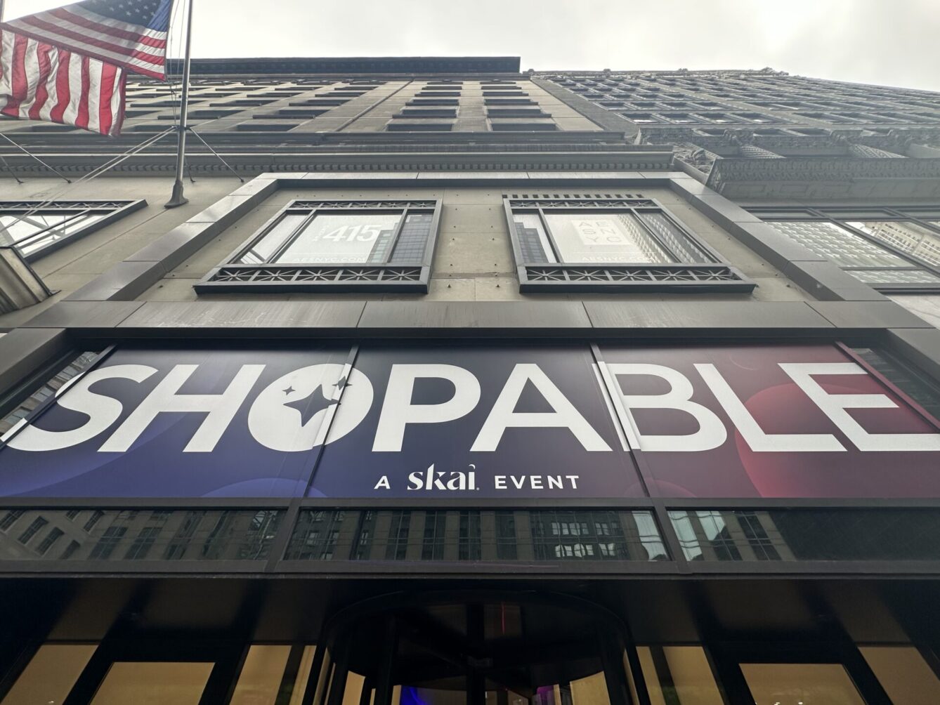
SKAI ShopAble 2026: Trends & Takeaways
Amp
Earned Media Is the New Infrastructure for AEO and GEO
Amp
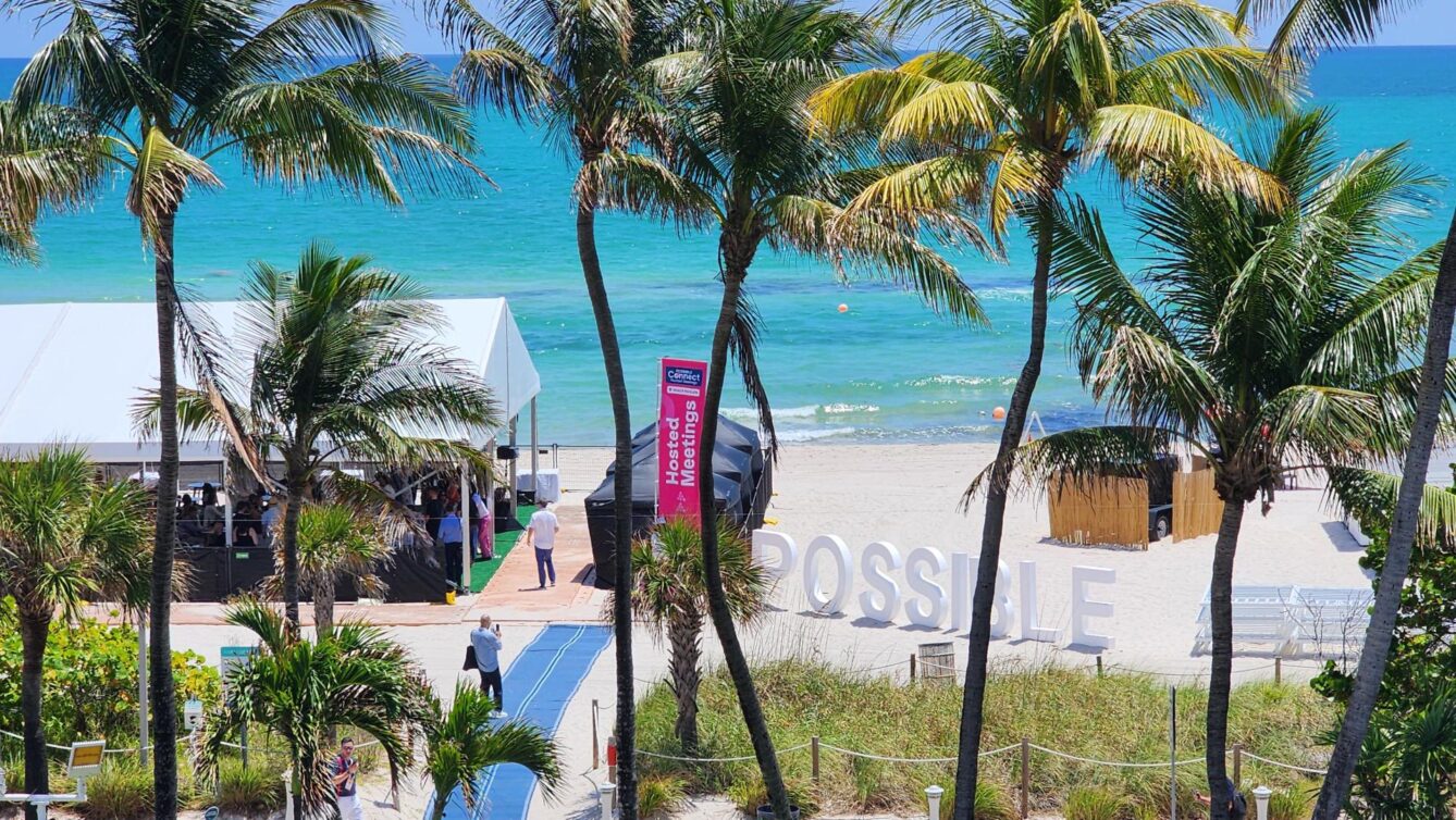
POSSIBLE Is the American Version of Cannes
Amp
1
2
3
4
…
9
Last
Let's start something great
Contact