Whenever I come across a conversation thread asking what characteristics are most valuable in a UX designer, I frequently see answers such as “desire to learn” and “creativity.” While I don't disagree that those are highly valuable attributes to have, having interviewed too many designers to count I think there is one additional overlooked characteristic that separates good designers from truly great ones: the ability to think multiple steps ahead and game out their solutions.
In the evolution from beginner to expert, designers go through somewhat predictable phases. As they move up the ability curve, most designers get to a place where they can take in the user needs for a particular interaction and come up with multiple options for combinations of UI elements and layouts that will achieve the desired user goal. Evaluating which of these options to move forward with is where the rubber meets the road, and it's the depth of thought applied to those evaluations that really define the line between good and great designers.
As a simple framework, we can think of design evaluation in 3 levels. At the first level, we assess the design to ask if it accomplishes the task we set out to do. Does our signup form allow the user to enter the necessary information to create an account? At the second level, we can evaluate the design for usability and even elegance. Is our form easy to use, simple, and even delightful? At the third level, we ask if our design is bulletproof. What are all the states the form can be in and does it still work in all of them? What happens if a user enters bad data? What if there is a connection error while submitting and also bad input?
Taking a design solution from acceptable to awesome requires thinking past what we see on the page. We have to think multiple steps ahead and be able to visualize not just the next step the user will take, but potentially two or three steps down the path. We need to think about not just the easy path through the flow we're creating, but also all the side paths the user may go down, and all the possible places that may lead. Further, we need to think not just about the simplest state of our UI, but also complex states that it could reasonably be in and make sure it works there as well.
Even good designers often stop at the second level (or do a light pass at the third), and rely on user testing, QA, and/or product feedback once a feature is shipped to find the flaws. User testing does have its place for this sort of thing, but is insufficient because it is difficult to make sure you've covered the less common usage patterns. Also, space and time for user testing is something we rarely have enough of, and it's better to put in the thought beforehand and save user testing resources for the most important feedback. Waiting until a product is in the wild to discover the flaws is something we want to avoid at all costs.
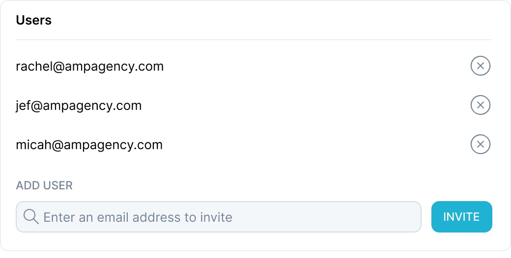
As a very simple example, consider an overly simplified UI for an admin to add users to a product. We've decided already that we want to invite users via email, and the invited user will click on a link and create their account. The admin will enter the email of the person to invite, click the “Invite” button, and the rest is up to them. After coming up with a few directions, we may decide that this is the strongest direction for our Invite Users flow:

Our level one evaluation seems to pass; this UI allows us to invite users. For level two, it seems relatively simple and straightforward, easy to understand, and quick feedback from others indicates it's understandable.
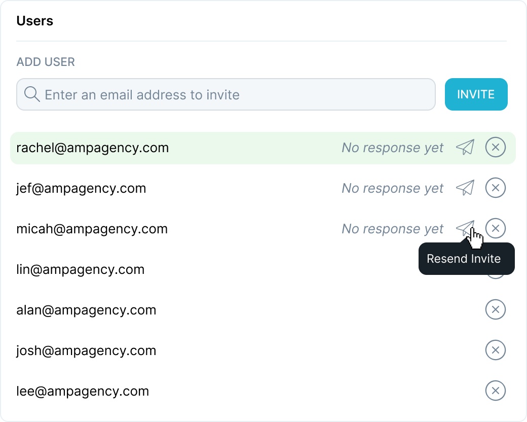
Level three requires us to start pushing on this until it breaks. While it would be good to actually draw out all of the states of the interaction (and best to prototype), we can start by simply gaming out a user interacting with this. First, they'll enter an email and click invite. What happens then? We want them to know they've been successful and who has already been invited, so perhaps we can add a successful interaction and a cool animation to add the newly added user to the bottom of the list. What if they add another? And another? What happens when they’ve added 10, 20, or more users? Our list may be getting longer, and eventually, our user invite form elements will be pushed off the bottom of the page “below the fold”. When a different user comes to this section later, after it already has 30 accounts in the list, they may not know to scroll down to the end of the list to find the form. We've identified a problem with our design already, and can adjust to fix it, perhaps by moving the user invite form to the top, like this:

In addition to evaluating our design for problems that arise from pushing our interactions in their primary incarnation, sometimes we need to think even broader and evaluate our designs at a system level. When designing large and complex products, often the specific interaction we're designing may need to be accessible from multiple places, or the interaction we are creating can be applied to additional interactions and it would be helpful to be consistent. Evaluating our designs deeply means thinking past just this page and applying our knowledge of the greater whole.
Expanding on our previous example, perhaps in our product we also have the ability to create projects and add users to the project. While designing the Invite User form and gaming this out in our head, we can anticipate that sometimes our users might create a project and begin adding users, only to realize that someone they want to add doesn't have an account yet and needs to be invited. We ideally don't want to take them out of their project creation flow to invite the new user, so perhaps we want to allow them to access the Invite User form from the Project Creation page. After considering options, we decide that we can put the Invite User form into a popup accessible from the Project Creation page so that they can quickly invite a user and then return to where they were and add them to the project. Our popups have a limited height, so will we be able to adjust our Invite User form to work in a popup? We can add scrolling to the user table to allow for a fixed height implementation, so our design should work even in that future implementation.
At this point, you might be either thinking that this is obvious and self-evident, or you're asking how you can start to incorporate this type of deep thinking into your design process. Even if you're in the first camp, we can always improve our evaluation skills and hopefully, there are some ideas here that can help.
1. Identify all possible states. In software development, when writing a particular function one of the first steps in testing is to identify all possible inputs that the function could receive so that you can make sure it handles all of them (even bad input). When designing an interaction, we should do the same with our user inputs and behaviors. It can help to make a list of every valid state the UI can be in, and also list out any possible invalid state as well. For something like forms, this can be somewhat straightforward (what could the user enter into this field that is valid/invalid?). For more complex UIs try to think of every valid/invalid permutation of the interface and list them out. If you have a long table of objects with actions, what are the states of this table? It can be empty, it can have a few items, and it can have lots of items. Perhaps we have a need to differentiate between having no items due to not having added any yet (first time) vs. not having any items because they've deleted them all (returning user).
2. Try to break it. It's easy to fall into interacting with your design like your ideal user; after all, you were the one who designed it with them in mind. Instead, at every decision point in your interaction, try to think of how a user might “incorrectly” interact with your design and game out what happens (“incorrectly” is in quotes because there is no wrong way to interact with your design; it's up to us as designers to facilitate successful interaction with our designs).
3. When in doubt, prototype. It's generally ideal, given infinite time and resources, to prototype everything to make sure it works how we expect. However, design resources and timelines make it inefficient (and probably unnecessary) to prototype every interaction. If you're doing something highly complex and gaming out every scenario isn't possible or easy, building out a robust prototype can help find corner cases and interactions you didn't anticipate. Be aware of the limitations of prototyping software like Invision however, and make sure that your prototype doesn't only embody the happy path through the interaction. Sometimes the very act of trying to build a prototype to support every possible user behavior identifies problems we need to address.


